Human perception in psychology is based on the relationship between objects and reality.
This relationship between object and reality forms the basis of the tenets of Gestalt principles in psychology.
Gestaltism in psychology has long been applied to design and other popular concepts such as Learnability. The core idea of the Gestalt principle of continuity stems from human perception. The founding fathers of the law of continuity in psychology established that the human perceives that the whole as different from its components. This principle is applied to UI and UX psychology and design to increase its impact on the human mind.
Gestaltism dictates that human perception is built on similarity, figure and ground, proximity, continuity, symmetry, closure, and synchrony. Applying it to UX and UI design increases its impact and makes for an interesting read.
Quick Overview of Gestalt Psychology: How Did it Begin?
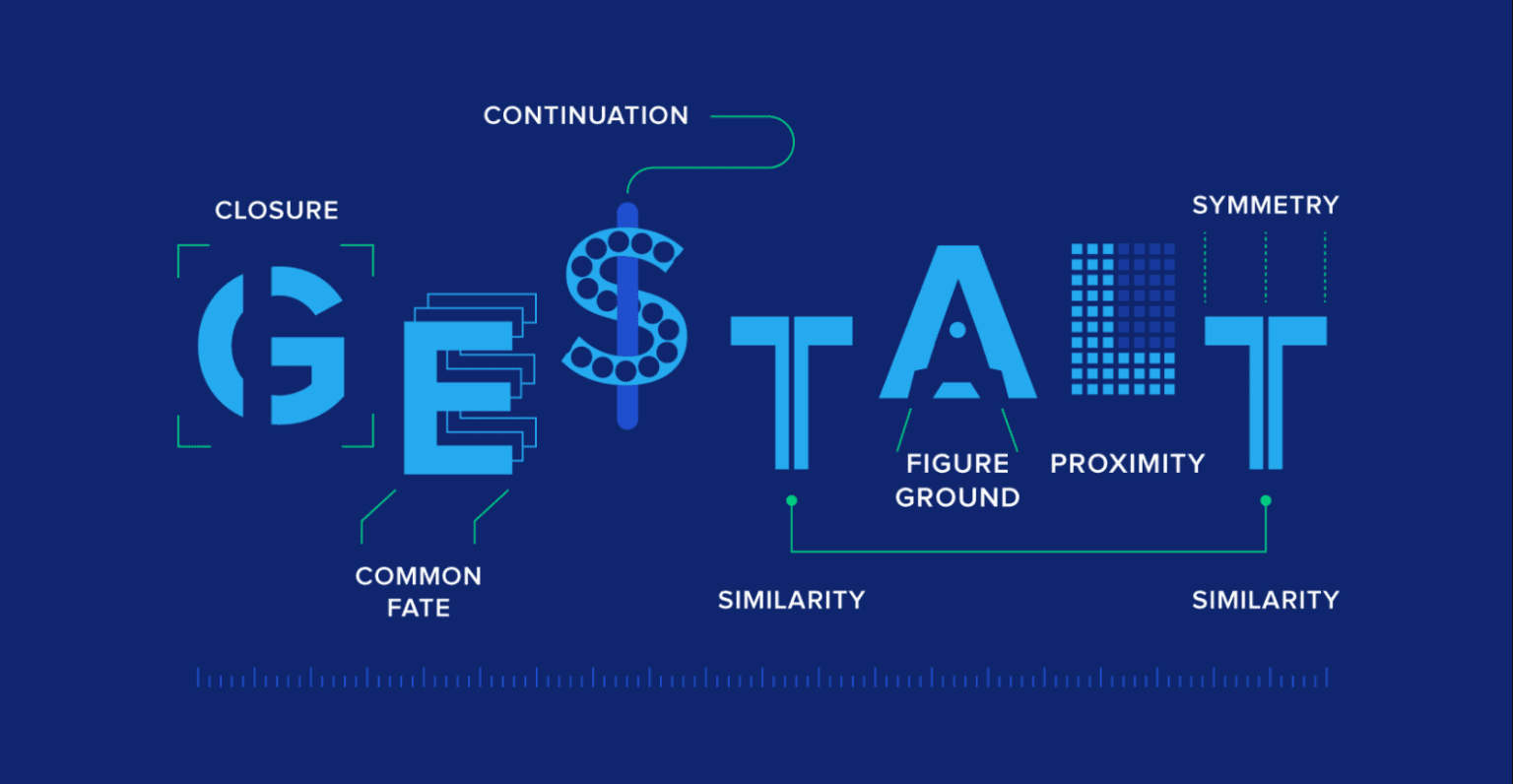
German psychologists developed the Gestalt school of psychology over the twentieth century. Gestalt principles underpin the modern theory of human perception. The theory is based on the idea that the human mind perceives the whole as other than the sum of its parts. This means that the human mind perceives the whole and its components differently.

Take the above figure and ground art as an example of the Gestalt principle. When perceived as a whole, you find yourself staring at an illustration of two individuals facing each other. But if you look closely enough, the image of a vase gets imprinted on your brain. The foreground and background of the illustration are perceived differently by the mind. Here, you see how your mind can perceive the individual components and the whole differently.
The etymology of Gestalt can be traced back to German. Gestalt in modern German means ‘put together’ or ‘placed’. Psychology defines it as ‘patterns’ or ‘configuration.’ Roughly speaking, Gestalt refers to patterns and how the human mind perceives them. The founding fathers of Gestalt theory are Max Wertheimer, Kurt Koffka, and Wolfgang Köhler.
Wertheimer identified the phi phenomenon a form of optical illusion. Perception then became an important topic for research in the Gestalt school of psychology. Gestalt principles of perception have become an integral part of design and art. Today, the theory consists of Gestalt principles that are applied to fields beyond psychology.
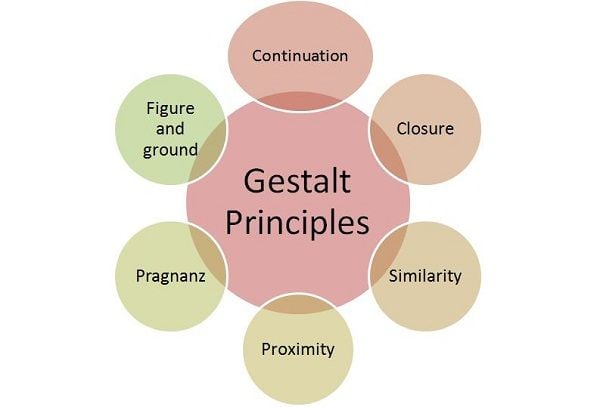
The Gestalt principles consist of the following concepts:
- Law of continuity: This principle dictates that elements present in a line or curve are perceived to be related as opposed to elements not present in a line or curve. The law of continuity uses order and symmetry to trick the brain.
- Closure: The human mind looks for familiar patterns in a complicated arrangement of elements.
- Law of proximity: Elements that are spaced together appear to be more related than elements that are far apart.
- Figure-ground: People perceive objects to be in the foreground or the background.
- Common region principle: Objects located in the same closed region are perceived as a group.
- Law of similarity: Elements of similar appearances are grouped and perceived as having the same functions. Similarity can be based on color, shape, and size.
Each of these principles is used for improving UX design. Every aspect of website design is rooted in Gestalt principles. For instance, our mind automatically perceives a blue text on a website as a link. This follows the law of similarity, as our brain groups blue texts together as a link.
The Gestalt principles are used for website design, infographics, animation, presentation, and social media carousels. The Gestalt principles of perception have an important role to play. They unconsciously influence the consumer while also improving their experience. These principles come in handy when one wants to improve the functionality and usability of the design.
For instance, our mind sees individual and unrelated components to a whole shape or object. Here is an interesting GIF where you can see a series of dots that looks like a dog walking.
In this article, we take a look at the Gestalt principle of continuity in psychology and how it affects UX and UI.
Here is a simple example of how visualization is made easy with Gestalt’s principle.

Gestalt’s Principle of Continuity Explained
The law of continuity in psychology unifies multiple elements on a curved or linear path. You are not the only lazy person in the room. The human brain is lazy and simplifies its work by finding a path of least resistance. Therefore, when elements are grouped randomly, the human will try to latch to a linear or curved path.
Lines and curves are seen as the least resistant and, therefore, the easiest visual stimuli for the brain. Elements in a line or a curve are perceived to be related to each other as opposed to those positioned randomly.
The sequential arrangement of elements depends on more than physical attributes such as lines, dots, or arrows. The human brain is adept at logically grouping elements. To ease its burden, it often puts similar things in categories. Therefore, the law of continuity in psychology depends on both physical and logical factors.
The Gestalt principle of continuity is used in multiple ways for design and art. For instance, there are patterns like the arabesques, ellipses, coincidences, and radiating lines in art. All these patterns are based on the Gestalt principle of continuity.
Notice how great artists bring about unity in their paintings and sketches through a mix of patterns. Unity in the painting is brought about by deliberately placed objects. Artists try to influence and guide the mind of their viewers.
Take the above example of Annie Leibovitz’s photograph, which uses ellipses to create unity and movement. It is a group photo, but one can see in the composition that she uses ellipses to direct the viewer’s eyes in a certain direction. The objects in the photo are placed in a curved path, so it is easier to follow with one’s eyes.
The law of continuity in psychology enables UX designers to use both positive and negative space judiciously in their work. Positive space in design refers to the subject of the design. Any space that is unoccupied by the subject is known as the negative space. When your eyes see a design, it uses both these spaces for perception.
Gestalt’s principle of continuity creates a hierarchy. One example of the Gestalt law of continuity can be seen in website design. E-commerce websites use it frequently to display their products. When shopping online, you come across certain broad categories and subcategories. For instance, the categories are placed horizontally across the screen. It includes home, clothes, and accessories, among others. The subcategories are vertically placed, so the user finds it easy.
The law of continuity in psychology is everywhere and influences human perception to quite an extent. Most marketing agencies depend upon psychology to direct consumer behavior. While it was always present in art, Gestalt’s principles of continuity are more practical today.
How does Gestalt’s Principle of Continuity effect UI and UX psychology?
The Gestalt principle of continuity is a valuable application in design. It passively guides the visitor’s eye in a certain direction. The law of continuity in psychology is a tool for navigation across websites.
Gestalt psychology explains visual perception. Visual perception is key to marketing in the 21st century. More than the design, it is the impact that matters. The design should be simple, economical, functional, and echo the brand’s vision. The design needs to be memorable and create a lasting impact on the consumer.
So how does one achieve such impact? The answer is using psychological principles. The law of continuity in psychology is one such principle that can be applied to marketing and design. The Gestalt principle of continuity has always been useful for photography and art. In the digital landscape, however, it has been adapted in the design field.
Ryan Hanau, a user experience design leader from San Francisco, explains how Gestalt’s principle guides his UX and UI work. For example, it should be a consideration when working with user guide software to create a set of UI patterns that help customers understand how to use a SaaS product.
The Gestalt principle of continuity can be seen in logo designs. The use of the law of continuity in psychology is subtle, but it leaves a long impact. Viewers often do not realize they are directed towards a certain element. How old were you when you realized that the arrow on Amazon’s logo has a secret meaning?
Take a look at the logo of Amazon. You will notice that your eyes are unconsciously directed from A to Z. It shows that Amazon has every product, from A to Z.

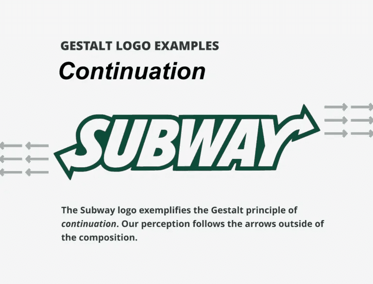
Subway uses the Gestalt principle of continuity. The arrows on the Subway logo influence our perception.
Now logically, since the law of continuity points towards a certain direction, it is useful for navigation. Since the human brain likes to follow routes, it is easy to direct them towards a certain goal. In UX design, Gestalt principles of perception can be used for both primary and secondary navigation.
One key use of the Gestalt principle of continuity can be seen in Google Maps.
What makes it so easy to follow the directions on Google Maps? The answer is linear routes. Mostly linear directions mark the paths on Google Maps. It makes it easy for the mind to follow and hence increases the functionality of Google Maps. Here, one can see that the Gestalt principles of perception directly impact both user interface and user experience.
Another fine example of navigation comes from Amazon. Amazon subtly guides its users from one object to another by similar grouping products in a horizontal slider.

Etsy uses it to display its categories across the website, making it simpler for the user to find.

The Gestalt principles of perception increase the usability of a design or art. It is especially helpful for branding purposes across websites to create a better user experience. The design might have a lot to do with aesthetics, but it must also be easy to use. Here, the Gestalt principles play an important role as they give you certain application ideas.
Final thoughts on the Law of Continuity in UX psychology
By employing the tenets of psychology, design can better predict consumer impact. It increases the artist’s clarity and helps them find a middle ground between creative liberty and the functionality of the design. It incorporates the use of negative space in the design. Moreover, the law of continuity in psychology can be used in multiple ways. In-depth knowledge of the topic can help create better presentations, graphic design, social media creatives, and other visuals. The growth of visual content provides fodder for design experts to implement the Gestalt principle of continuity.


