In the long and winding road of product development, UX research is typically the first step of that perilous journey.
The reason is logical. A discovery stage needs user research to identifiy user pain points, prove the product-market fit, and refine the product concept.
But it doesn’t stop there. Successful teams utilize user research methods throughout every stage product development journey. They continously reiteratine, prioritize, and uncover new insights based on user testing and user interviews.
In other words, UX research methods help keep product development on the right path. They ensure teams remain customer-centric, and prevent you from getting lost in a land of frameworks and processes that don’t actually add value.

Product teams can choose between many types of UX research methods. Some methods are more suited toward certain kinds of products. But pinpointing the right research method is not always a straight-forward process.
You may still be wrapping your head around the difference between qualitative and quantitative user research.
You may be wondering whether you really need a UX research repository, or asking yourself how to best measure the user experience without introducing bias.
We’re going to deep-dive on the fundamental UX research methods, while explaining how you can leverage UX documentation and AI-powered meeting summarizers for actionable user insights.
We’ll even recommend some free user research software to get you started, from Voice of the Customer tools to A/B testing platforms.
What is UX research?
UX research is learning about and understanding user needs, motivations, and behaviors through observation, testing, interviews, and other methods. A team, or an individual UX researcher, investigates what people want, finds gaps in the market and users’ frustrations, and then takes that data (a mixture of both quantitative and qualitative) and turns it into a “plan.”
UX stands for “user experience” and is all about just that – people’s EXPERIENCE. The ultimate goal is to make individuals, teams, or whoever we’re looking to create and build a product for have a wonderful, enjoyable experience. If we can do that and people buy it, the UX research stage has succeeded.
Hoorah! Let’s all have a party, and everybody gets a raise, right?
What is the UX Research Process?
Different products and different markets require a different strategy for each. There is no “one-size-fits-all” approach to UX research, but areas can be used, borrowed, and shared across all industries and product types.
Certain types of research and data that may work for a software design team probably won’t work for a pet food company. Fido doesn’t care about megabytes, after all. However, the opinion and feedback of the software users can be collected similarly to if you were getting feedback from Fido’s owner.
Pet food and software aside, the UX research process can be broken down into the following areas. These can be followed linearly, but most will find that you’ll bounce back and forth through the steps and circle back a few times.
Exploration, Discovery & Uncovering

Ask those big questions! But remember, we’re looking for answers too! This is where you find out the lay of the land, the big picture deal, if you will. What is happening out in the world? Who would we consider to be a competitor? And what are they doing right now? Is it good? Can we do better?
The big question out of all of it, and one that anybody who works in Product must ask, WHO are we trying to solve problems for? Dig deep!
Collation, Analysis & Research

After we have gone and asked and collected all those wonderful little bits of data and insight, we have to decode it all. In this stage, we look for patterns, trends, and surprises. There’s always something interesting to find at this stage. Maybe your idea was right, and now you have the factual data to prove it (ah, but make sure that we’re not looking at a big old case of RESEARCH BIAS 😱). Or has it thrown up some surprises? Once we can see the picture in the data, we can see whether it has legs or if we need to keep digging around.
Concept
You’ve got all the info, and now, armed with this knowledge, you can start conceptualizing the product. What features are a must? What is a “nice to have”? How will it look, feel, and act? What can you do differently? What is the purpose of this product? This is an exciting stage because the idea takes shape and becomes an actual living, fleshed-out THING rather than an abstract concept.
Development & Prototype

You actually get to build the thing now! While it may not be the whole package at this point, you can really start to get a feel for what the end product will look like. A prototype also allows you to test out ideas in a quick and dirty way. You can then take it to the users and get feedback. Many great ideas have been sandboxed at the prototype stage as a great idea, in theory, doesn’t always work in practice. And while that may be disappointing, it does save a hell of a lot of pain in the long run!
Testing, Testing, 1, 2, 3

It’s a bit more hands-on, but testing and UX research are dreamy bedfellows. UX research is asking questions and doing surveys. Sure, that’s part of it, and we will get into that in a bit, but testing a prototype or a minimum viable product (MVP) is also fun! You get to see the reactions to the “baby” that Product has created. Do people love it? Does it fix their pains? Is it a “goer”? Any assumptions that you have, any doubts that you may have raised with higher-ups, this is the stage where it becomes a reality.
Assessment, Tweaking & Adjusting

We don’t all get it right the first time. There’s always going to be something that needs to be adapted, changed, or slightly refined. However, these “tweaks” are based on actual data. You take everything you’ve learned in the UX research process, all that lovely insight, feedback, and competitor research, and you pour it into your product. Weighing it up and ensuring that whatever is delivered fulfills the need.
While this isn’t the end of the road for products, for the UX research team, the foundations are laid, and the product has become something in its own right.
Quantitative Versus Qualitative Research

These two “types” of research culminate in two different types of data. Both are incredibly important to UX research, and while they can be used individually, they are best used in conjunction with each other to build a true, data-driven picture.
Quantitative Data is all the numbers and metrics. It’s the stuff that you get from surveys, polls, and other measurable sources. You’re looking to quantify sentiments, attitudes, and opinions scientifically so that you can compare results and make decisions on them.
Qualitative Data comes from interviews, focus groups, or observations of user behavior. The qualitative collection of insights and opinions adds a more “human” side to the research. This is where you get a personal insight into user behavior, their motivations, what works for them, and what doesn’t work for them.
An example of these two research data sources used together is website design.
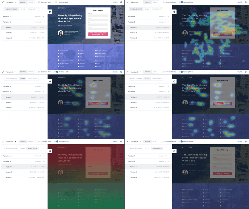
Something such as Google Analytics and HotJar can be used to see how many people are finding the website through search engines; you can see how long they are staying on the site or if they are leaving. This gives measurable metric data, graphs, and heat maps.
By asking people questions about their experience using the site, they will be able to give you words, thoughts, and feelings, which can then be looked at in conjunction with the figures.
If the data shows that people leave the website after one page, but the interviewees tell you they “love” the site, what does this say?
Either the interviewees are telling white lies, OR the website is so effective that everybody finds everything immediately. By digging deeper into these data sets, you can uncover patterns, trends, and, hopefully, the truth.
UX Research Methods Cheat Sheet
Now, to get to this golden point of UX research Nirvana, we must pull a few tricks out of the bag. These are our wonderful user research “methods.”
Different methods bring different insights and benefits, each with its drawbacks. The key is that they are each a cog in the much bigger UX research machine.
User Interviews aka finding out the WHY
The most well-known is the user interview. It’s a topic we have covered thoroughly across several blogs, but it’s an incredibly powerful tool for exploring and understanding user needs, experiences, and behaviors.
User interviews are where you seek out your product’s users or potential users and interview them. It sounds decidedly simple but is actually more of a challenge than you’d expect.
PROS:
– Interviews allow for deeper insight and understanding of user behavior
– Gives users a democratic voice and an opportunity to have their say on the product
– You can ask questions that you may not even know need to be asked
– Helps to build empathy with users
– Can be shared among the entire team
– Can be recorded, categorized, and stored for a later date in a repository
CONS:
– Time-consuming
– Can be costly, mainly if you’re using a 3rd party service or offering incentives
– Subjective nature of data collected
– Bias depending on who is doing the interview
Surveys & Questionnaires AKA finding out the WHAT
Surveys and questionnaires can be great if you want to collect a large amount of data quickly and cost-effectively. They are a perfect example of quantitative data, which can be turned into visual graphs and used with more qualitative data. Sites like Survey Monkey can be set up in just a few clicks, and even Google forms can be used.
PROS:
– Quick to create and deploy
– Reach a large number of users quickly and cheaply
– Collect mainly quantitative data so easier to analyze and visualize
– Easy to measure changes over time with the same survey
– Can be anonymous, allowing people to express their true feelings
CONS:
– It doesn’t allow for follow-up questions or further discussions
– Limited to the number of questions and types of data that can be collected
– Can be confusing if not appropriately designed with a clear objective
– Responses may be skewed by biases from the people who designed the survey
– Overly simplified responses mean that you can miss out on nuance from users
– If people don’t understand the concept, they may just click buttons at random
– If incentives are offered, this can lead to false data that skews results
Focus Groups
A little of this, a little of that. Focus groups are great for bringing together users and creating thought-provoking discussions when it comes to overall user insight. Focus groups can be incredibly dynamic and can be somewhat surprising. It’s also a way of getting many voices and diversity into your research plan.
PROS:
– Opportunities to hear a range of opinions in one setting
– Free-flowing and organic conversation allow for incredibly natural insight
– Can help to identify patterns or themes among users
– Easy to generate ideas, especially if you are looking for creative solutions
– Allows the user to draw upon each other’s knowledge and experiences
– Moderators can ask follow-up questions and dig deeper
– Can be run remotely using tools such as Zoom and Google Meet
– Can be recorded, categorized, and stored for a later date in a repository
CONS:
– They can be expensive and time-consuming to set up
– Are typically only useful at the beginning of the process at the conceptualization phase
– Difficult to control dynamics within the group
– Results can be affected by dominant participants or loud personalities
– Not great at getting at user behaviors, as there is no direct observation of product interaction
– The moderator’s questions and direction may bias results.
Card Sorting
Card sorting is a user research method that can be used to understand user needs, behaviors, and preferences in a kinesthetic and visual way. Card sorting is an activity where research participants are asked to organize information into categories. It allows users to provide direct feedback on how they would prefer the content or menu of a website or app to be organized. While it can vary from individual to individual, with a large enough sample size, you’ll see where particular pains and preferences are typically found. It’s incredibly useful to create, and also to evaluate, the information architecture of the product. This isn’t just the way that the whole product is organized but the language used and other aspects.
PROS:
– Quick to setup and can be done remotely
– Easy for participants to understand, making it exceptionally user friendly
– Helps to identify patterns of how users prefer content or menu structure
– Allows you to gain insights from a large number of people in a short amount of time
– Can be anonymous, allowing people to express their true feelings
– Can be recorded and stored for a later date in a repository
– Can be used before and after you build a product
CONS:
– Results can vary depending on the type of card sorting used
– Does not explore user behavior or motivations, only preferences if done without correct questions
– Results may be affected by biases from the people who designed the cards
– Results may be skewed by language, cultural differences, or literacy levels
– Difficult to measure changes over time with the same card sorting exercise
– Only really suitable for certain types of product
Tree Testing
Tree testing is a user research method that helps to uncover how users navigate, browse and search for information within an interface, typically a website or app structure. It’s a great way to test navigation labels and ensure that what may seem like “logic” isn’t actually user-unfriendly. Participants are asked to locate content or products based on menus and categories created by the researchers.
PROS:
– Can be done remotely
– Quick to set up and can produce results within a short amount of time
– Gets at user behavior rather than just preferences
– Easily recorded and stored to be referred back to at a later date
– Measures whether users can find content or products easily
– Provides a good indication of how well the navigation structure works in reality
– Can be anonymous, allowing people to express their true feelings
– Works incredibly well in conjunction with card sorting to confirm findings on structure
CONS:
– May bias results depending on the design of the task or menu structure
– Not suitable for testing complex user flows or actions
– Results may be affected by language, cultural differences, or literacy levels
– Difficult to measure changes over time with the same tree testing exercise
– Results may vary greatly depending on the size of the user sample being studied.
– May not be suitable for all types of products or services
Heuristic Evaluation
A heuristic evaluation is excellent for zoning in on usability problems. It is a method whereby experts review an interface and evaluate it against a predefined set of usability criteria. This evaluation requires the expert to go through and analyze each element on the interface, like buttons, text fields, menus, etc., one by one. It’s great for identifying user experience issues in a systematic way rather than just looking at how people click and play about with a user interface or structure.
PROS:
– The results can be more accurate and reliable as it is experts conducting it
– Good for finding particular issues within an interface or product
– As well as the “big” issues, it can also find the more minor problems that could be overlooked
– It could be cheaper. By hiring a smaller amount of experts rather than a larger group of end-users, you can get both points of view.
– It can be recorded and stored for reference when changes are made to the product or interface
– Can save you time as it’s a speedy process, and results come back relatively quickly
CONS:
– The results are all dependent on the quality of the evaluator and how well the heuristics have been defined
– It may be biased or led by the evaluators, who have their own opinions
– It can be difficult to measure changes over time if the same experts evaluate different versions of the product or interface
– While the evaluators may be experts, it’s not necessarily democratic for the end-user
– May not be suitable for all types of products
Cognitive Walkthroughs
Many people assume that heuristic evaluation and cognitive walkthroughs are the same. While there are some similarities between the two methods, a cognitive walkthrough is driven by a task and is based on task analysis. It is a technique that focuses on the user’s mental model or how they think about the product or interface. It looks at how people perceive and understand an interface while completing a task by formalizing how people’s thoughts and actions go while “walking through” an interface. It’s a great way to identify usability mistakes and gaps in the experience that affect the learning process of a specific task within a product.
PROS:
– Great for looking at how new users discover and interact with a product or interface
– Can measure how users achieve a goal or complete a task
– Can identify usability issues that may not have been found in other evaluations
– Focuses on the user’s mental model and cognitive processes, which can show if an interface is intuitive or not
– Easy to record and compare different versions of the same tasks with different individuals
CONS:
– While the method has been adjusted and adapted over the years, it was created for simple processes. This means that while it CAN be used for more complex issues, the more adjustments, the more it can skew the method itself
– Not ideal for more experienced users since it might miss out on usability issues that experienced users have adapted to
– Can be biased by the evaluator’s own cognitive experience or knowledge of the product
– Results may vary greatly depending on the size of the user sample being studied and their levels of familiarity with the interface
– It may not be suitable for all types of products or services
Tools, Tips, Resources & More To Help With UX Research
tl;dv = The Perfect User Research Companion!

tl;dv’s features could help streamline some of these processes by providing an easy way to record user data, share documents and collaborate with the entire team. As a user research tool, you can create a central repository to store all your UX research findings in one place. It also has powerful search capabilities to help you quickly find your needs. What’s more, it makes research sharing easy so that everyone is on the same page and has access to the same information.
While not every UX research method will work with tl;dv, a whole heap of them will. And, if you have a team that is spread out across the world, then it’s a great way to document and store every sync-up, catch-up, and user interview.
Whatever UX research method you prefer, use, or implement, keep tl;dv in mind to make sure to save all your user research findings. It’s free, it’s fun, and it stops boring admin work, so you can get on with the important job of changing the course of human history with your next product. 😁😁😁😁😁😁
