Let’s jump straight to the point: nobody – and I mean NOBODY – has the time to read a 10-page long UX research report. We’re living in the digital age. Things are fast and fun. Our attention span only just pips that of a goldfish so you should always, always, ALWAYS write up your product research report with that in mind.
With your current plan gone for a burton, you might be left feeling daunted and hopeless. How could you possibly condense all your hard-earned research into something that can be read in a flash?
Fear not, young padawan, there are plenty of ways you can make your UX research presentation entertaining and informative. In a moment, we’ll get down to the nitty gritty details, but first, let’s briefly cover the basics.
Oh, and don’t forget the obvious: the user knows best – even if Ian doesn’t think so.
@tldv.io We love constructive criticsm #productmanager #product #tech #productmanagement #corporatehumor #startup
♬ original sound - tldv.io - AI Meeting Recorder
What is a UX Research Report?
A UX research report is the finishing line. You’ve spent dozens of hours planning, researching, and analyzing data so that your product team can make clear and informed decisions. The UX research report is the culmination of all your work, and you must channel it into a concise piece of art that skillfully unravels the data that your long hours of research has revealed.
If the research is planning, writing, and filming a movie, the UX research presentation is the final product – the movie itself. Without a crafty editor, all movies would just be a disconnected jumble of scenes. Your job is to weave a narrative into your research data and unveil what’s needed in a way that excites, entertains, and inspires your colleagues. My friend, you are the director now.

What Needs to Be Included in a UX Research Report?
Any kind of product research report or presentation should include the following three things.
1. What You Did (and Why)
Also known as the study overview, this section covers why the research was conducted in the first place. What was the purpose of it? Give a punchy introduction, a one-line summary that engages the audience immediately.
Next, you’ll want to cover your research scope:
- The research objectives
- Your methodology
- Your research questions
- A summary of your research participants
As with the entire UX research presentation, keep it succinct. Don’t ramble or add more detail than necessary. Sometimes less is more.
2. What You Learned
This is where you want to summarize your key insights in a simple page. Choose the 3-5 insights that are most valuable to your team. Any more and you’re going overboard.
This is often the most important part of the entire product research presentation. Make the insights stand out from one another; make sure they are clear, distinct, and ready to carve out a slice in your reader’s brain so they can live there rent-free in the future.
Use all the skills you have to make these insights memorable. You worked hard to uncover them; don’t let them go to waste by failing to present their full potential.
One of the ways you can do this is by getting straight to the point. Cut the fluff. What did your data reveal and how is that relevant, and important, to the product?

After the summary of key insights, you’ll want to include all your learnings in detail. You still want to be sharp and direct here, but you can include more detail than in the summaries.
If you have any special research artifacts that you can’t fit in in full, like user journeys, archetypes, or competitive analyses, it’s a good idea to include a high-level overview then link to the artifact file for further details.
3. What Happens Next?
Just like with a book, the beginning has to catch your reader’s attention, the middle has to push them forwards, gaining momentum as you go, and the ending has to make a BANG. If you do a great beginning and middle but mess up the ending, your stakeholders will feel lost, confused and irritated. For this reason, you must close the UX research report with a clear call to action.
After being shown the data-driven evidence, the call to action should seem like a natural close to the product research presentation. It won’t draw attention to itself, but rather draw attention to the new goal.
Potential action statements can include:
- Product opportunities
- Design improvements
- Open questions that may require follow-up research
Don’t be afraid of giving recommendations when you’re presenting your research. You are the expert here. You are the one that conducted the research. In this element, you know best.
UX Research Report Tips
If you’re ever short of UX research method ideas, we have a big fat list that you can use for inspiration. Otherwise, you can take a look at the tips below for creating cutting-edge UX research reports.
Empathize With Your Participants
You know that thing humans are capable of? Empathy? Use it.

By truly listening to your users, you will understand their problems and be able to accurately convey their desires to your stakeholders and other teammates.
Use the Voice of the Customer
Could there be an easier way of convincing stakeholders to make a decision than having them hear it straight from the horse’s mouth. By recording your user interviews with tl;dv, you can easily include snippets in your UX research presentation. You can make clips, reels, and highlights of multiple user interviews to really highlight the user’s opinion with their own voice. You don’t need to be a video editing whiz to do this either, tl;dv makes it exceedingly simple.
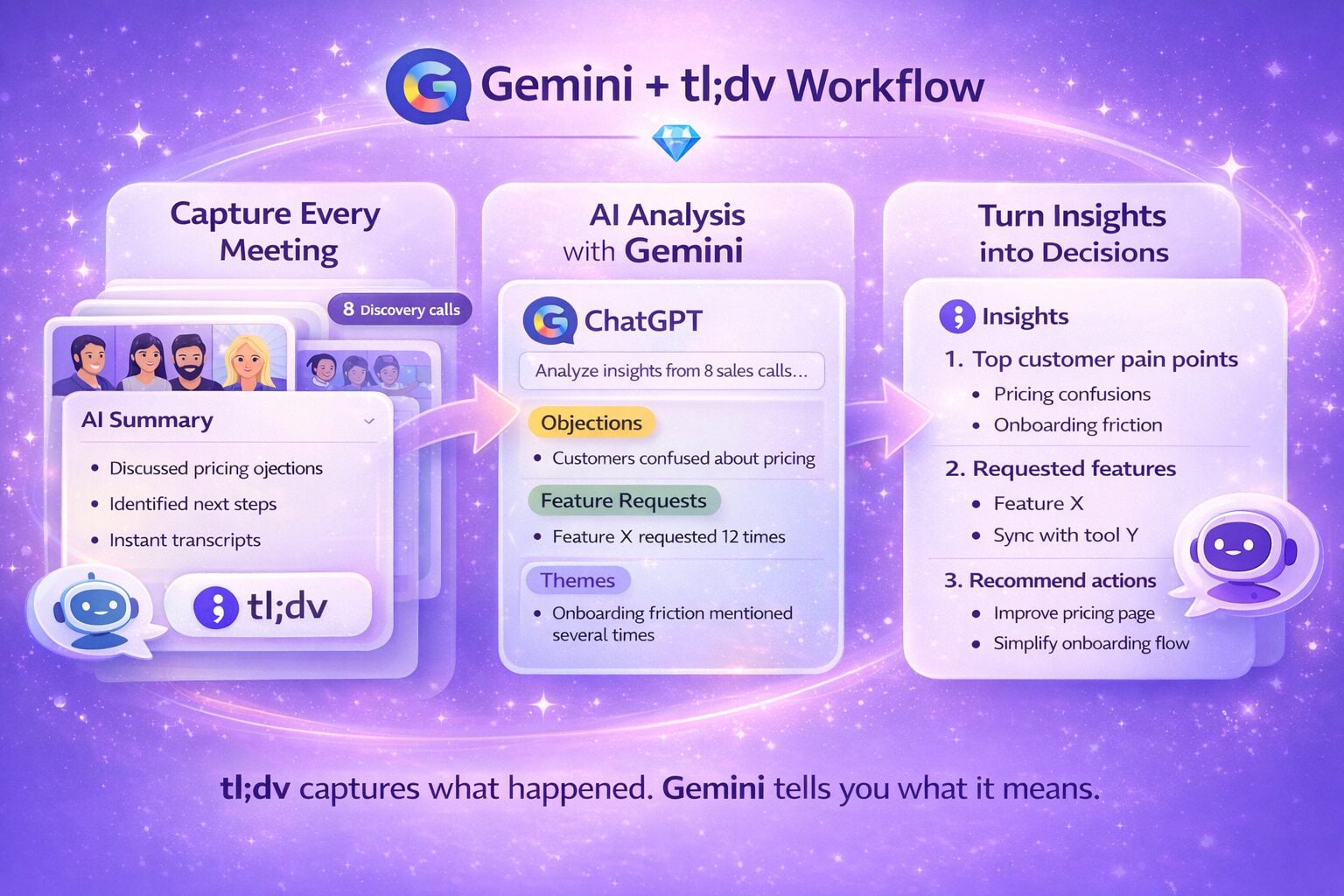
In fact, tl;dv automatically summarizes each meeting with their GPT-powered AI. You can also use it to generate notes, or even highlights by searching for important keywords throughout your transcripts. Like this, tl;dv will become your new UX research repository.
Not only will the voice of the user be a lot more effective than yours, you won’t have to pay a penny to use it. Just download tl;dv for free for Google Meet or Zoom and get started today.
Make it Visual

When we said nobody wants to read a 10-page report, we weren’t joking. Embrace the visual aspect of presentations. Include images, infographics, colors, shapes, quotes, memes, gifs and more. Make your report engaging in every way possible.
Obviously, we don’t mean to suggest that adding random images will improve your report. Keep consistent to your topic and keep the visualization aspects in the same vein too. So long as the data and what it suggests is coherent in your mind, then it will be coherent in your report too.
A bit of writerly advice: don’t be afraid to write a vomit draft to get your data and ideas for recommendations down on the page. It’ll help you understand it more and nobody ever has to read it. Once you understand it clearly in your head, you can craft it, tweak it, upgrade the design and keep everything consistent and engaging.
Pay Attention to Detail
We’re not just talking with the data here either. If your report is riddled with typos or other grammar errors, nobody is going to give a sh*t about your research. It’ll all be for nothing. Use a spellchecker, then use your eyes, then use a spellchecker again.
Spread it Far and Wide
Don’t limit your presentation just to the stakeholders. Share highlights of your study in your team’s internal communications channel. Everyone in your team should be inspired and motivated by the research you’ve conducted. It’s important that the insights gathered are understood by the entire team, not just the top-level decision makers.
Make it Entertaining
If you haven’t realized, this is 2023. It’s the age of social media, memes, and shorts. Don’t be a Scrooge. Making your audience laugh (on purpose) is the epitome of engagement. They’re far more likely to listen to your next words if you just caused them to erupt uncontrollably.
However, it’s important to keep a level head and remember what the topic is. Don’t try to be funny just to make people laugh. Always keep it relevant, and if you’re getting too carried away, just listen to Ross.

How to Make Your Presentation POP
By now, your UX research report should be rockin’ and rollin’. But not all stakeholders are part of the remote age where a simple email will do. Some still want a good old fashioned presentation, boardroom and all.
This is your time to shine.
For those nervous about the big pitch, keep these 3 tips in mind and you’ll be fine.
1. Remember the 3 Cs
When you speak, be clear, confident, and concise.
Clear
Be direct but friendly. Deliver your words with clarity, checking yourself for mumbling. Speak with intention.
Confident
When you speak confidently, people listen. One of the best tips for being confident is making sure you know your stuff like the back of your hand. When you really know the data you’re talking about, nothing can faze you. No questions can surprise you. You’ve got nothing to be afraid of.
Practice projecting your voice so that you are loud enough to be heard, but also self-assured enough to be trusted. Avoid using filler words and always try to make eye contact with your audience. You’ll appear a whole lot more knowledgeable and credible if you do so.
Concise
This means get straight to the point. Don’t hold the stage for longer than necessary. Get up, say your part, show the evidence, and get out of there. Just as nobody wants to read 10 pages, nobody wants to listen for hours either. Be succinct in your delivery and the audience will thank you for it.
2. Practice, Practice, Practice

The best thing you can do if you’re feeling a little nervy is practice. You can try recording yourself using a meeting recording tool if you like so that you can see how you can improve on a rewatch.
You can also grab a partner that isn’t part of your work team. These guys can be life savers as they’ll easily pick up on things that you’re too close to notice. Things like jargon for starters…
3. Don’t Just Read From the Screen
If you have your product research presentation in front of you, it might be tempting to just read what you wrote. After all, that’s why you wrote it, right?
Wrong.
This presentation is meant to engage and persuade, not bore to tears. By talking actively with the audience, you can promote engagement and even ask questions to keep them on their toes.
If your presentation is definitely in person, you could cut some parts from the presentation slides so that you can talk about them instead. Keep only the most vital information on the slides themselves. You’re there to elaborate.
Take Your UX Research Reports to the Next Level
Now you’re ready to face the world. Gone are the days where bible-length UX research reports were acceptable (or readable). Now is the time to bring your A game.
Pluck from the modern world, entertain and engage, and convey your users’ insights in a way that convinces and persuades your specific target audience. You know them best.


