The website user experience (UX) is all about ensuring visitors can intuitively navigate your website, understand your business purpose, and convert with ease. It minimises confusion and promotes a positive experience of your brand or product. For example, checkout UX design is the process of creating a user-friendly checkout page. You can increasee the likelihood of conversion by:
- adding a guest checkout option;
- reducing the number of steps and entry fields;
- providing more payment alternatives;
- showing necessary information before paying.
Any website, be it eCommerce or SaaS, requires flawless UX. Why? The answer is that it influences conversions, bounce rates, and other crucial website metrics. The user experience can also impact the website’s position in search results. In fact, UX is becoming an increasingly important ranking factor for websites.
However, building a useful and attractive website takes time, contemplation, and stamina. How can you create a good and working website to convert visitors into customers? Let’s consider five UX improvements. Building a website while considering these UX tips can help uplift your brand with the assistance of a professional UX design agency. These ideas apply to building your site from scratch and optimizing existing ones.
5 UX Improvements to Increase User Satisfaction and Sales
1. Take Care of Loading Speed
Why should you take the loading speed seriously? It’s the first thing website visitors encounter before the content appears on the screen. And the loading speed determines whether they’ll stay on the page, convert, or not.
Here is what Envisage Digital says about page speed importance. Even a one-second delay matters. Page views (11% drop), conversion rates (7% drop), and customer satisfaction (16% drop) may suffer if readers have to wait. Aim for 1-3 seconds as a loading time. The bounce rate is minimal at this stage, reaching only 32%. But if you add one more second, this parameter triples to 90%.
2. Cater to Mobile Users
Mobile searches are now equal to desktop ones, if not more. Customers access websites from mobile devices on the go to look through product catalogs, read articles, and find answers to their questions on the spur of the moment. So leaving this segment is inexcusable negligence. Why do you need to optimize your site for mobile devices right now? The reasons are evident:
- higher ranking by search engines;
- traffic increase;
- bounce rate decrease;
- conversion rate boost;
- positive impact on customer loyalty.
Does your website meet the requirements of mobile-friendliness? With the emergence of the mobile-first approach, unclickable buttons, small fonts, and inconvenient navigation should fade away. Here are some of the UX improvements to implement in the website’s mobile version:
- Create adaptive content.
- Check the size of CTA buttons and fonts.
- Place page elements in a thumb-friendly zone or at the bottom of the screen.
- Break texts into smaller paragraphs.
- Monitor the Google Analytics dashboard and regularly conduct mobile site performance tests to uncover more issues.
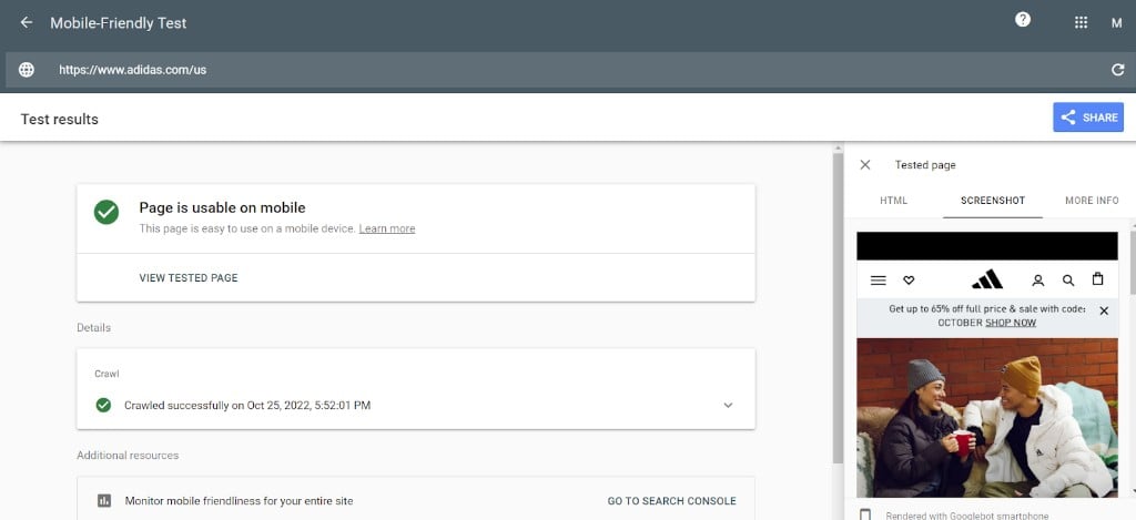
Let’s run the test on the Adidas website as an example. We can see that it has successfully passed the assessment. Good for Adidas!

3. Deal with 404 ‘Page Not Found’ Errors
No one wants to stumble at a dead end. Especially when you are about to find the desired product and there is so much competition in the market. That’s why you should revise the website and reduce the number of 404 error pages.
A Page Not Found issue is one of the most widespread on the web. Why? Because there are many reasons for them to happen:
- The website has moved to another URL address, and the website owner forgot to redirect it.
- The page is unavailable due to the product going out of stock.
- Users misspelled the link while typing.
Whatever the reason, such mistakes may spoil the user experience as much as slow website loading. And the chances are these people won’t come back to the store.
Install Google Webmaster tools on your website and check crawl errors to see if you have any 404s. Or choose from the existing free 404 checkers like Sitechecker, SE Ranking, Screaming Frog, etc.
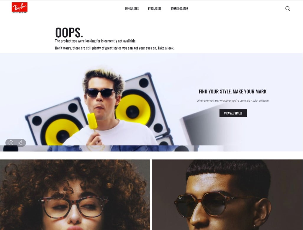
Another crucial step is to arrange the 404 error pages to increase conversions. For example, you can add a little humor, provide the navigation menu and search, or show the best offers on this page to return prospects to the sales funnel. That’s what Ray-Ban implements on its website (see the screenshot below).

4. Offer Personalized Guides
Why not provide your online clients with personal assistance as if they came to a physical store? It is achievable by placing surveys and guides on sizes, styles, models, and shades on the site. Such functionality is one of the UX improvements that will allow you to collect valuable client data and then employ it to select relevant products. It will undoubtedly help consumers in making purchasing decisions.
Let’s see how such a quiz works on the Living Proof website. Visitors need to answer a series of questions about their hair:
- preferred method of hair drying;
- structure and density of hair (not as precisely as a density calculator);
- problems related to hair and scalp;
- hairstyling habits;
- types of products in use, etc.
At the end of the quiz, shoppers should enter their age, name, and email. As a result, the client receives a selection of the brand’s products picked out exclusively for them. People can immediately add products to the cart and place an order.
5. Reach Out to Your Actual Users for Feedback
Do you need more insights into possible UX improvements on your website? Reach out to your visitors or users, and ask them about their experiences and expectations! This is the perfect way to gain invaluable insight on what your audience would like you to prioritise in terms of website developments and design updates. Neglecting customer feedback not only leads to missed opportunities but also put the business at risk.
Launch a customer survey on the website or make user research calls using remote user research tools like tl;dv. This solution lets you record and transcribe user conversations on Zoom and Google Meet for free.
Once you’ve captured these user insights, you can share specific moments from the user calls with timestamps or the clip-making tool. Share a clip in which a user describes an error they’re experiencing, or link to the moment a user expresses great feedback. You’ll bring customer voices closer to your organisation without placing hardly any demands on your colleague’s time.
In a UX research session, ask questions like:
- What would users change on the website for a better experience?
- Is the website purpose and structure clear?
- Which features or resources would be helpful when browsing the website?
- Are you satisfied with the overall UX?
Gather the results, analyze them, and look for trends. For instance, if 60% of respondents say they have trouble finding certain Help Articles or products, then you might want to include a search bar in an especially visible location, or include more internal links. In short, collecting sonsumer feedback is one of the most effective steps you can take toward enhancing your website UX, providing you make corresponding adjustments.
The Key Takeaways
It’s not enough to create a website and leave things as they are. Suppose it drives a good share of traffic. What else can a business dream of? All your efforts can go to waste if your site doesn’t convert visitors into customers. After all, your main aim is to sell your products and services. That’s where polished UX may help.
Monitor website metrics and other signals. Do visitors stay on the page? Do they respond to calls to action and subscribe to newsletters? The final goal is to encourage them to add products to the cart and purchase goods, which you can reach with the help of UX improvements:
- checking and accelerating website loading speed;
- ensuring mobile-friendliness and adaptiveness;
- organizing 404 error pages;
- personalizing offers and deals;
- asking visitors to leave feedback and translating their input into an action plan


